POUR
Branding and Identity Design

Project Overview
Pour is a neighborhood coffee shop that was looking for a holistic brand identity design that connected its mission with its clients in advance of opening day. The branding design was a key part of sharing Pour’s personality and mission with neighbors, building excitement and strong relationships early in the business’ life.
Project Role & Scope
Project Goals
As lead Visual Designer, working directly with Pour’s owner I was hired to develop comprehensive brand identity guidelines for Pour including:
-
Color Scheme
-
Brand Typography with Scales
-
Brand Logo and Iconography
-
Imagery Guidelines
-
Social Media Headers & Guidelines
-
Brand Style Guide
Pour was a new coffee shop that was to be a neighborhood anchor. Developing a strong look and feel that took into consideration its future patrons’ sensibilities and lifestyles was a key part of this project.
Keeping an eye on Pour’s mission of providing a place to “sit, gather, and be, welcoming our neighbors to enjoy each other’s company over a cup of what-you-will,” I reviewed user personas and a cross-section of Pour’s client base to inform the visual design’s development.
Problem
Solutions
How will we build brand awareness and hype around a soon-to-be opened neighborhood cafe?
For this project I developed a complete, packaged set of brand identity guidelines including a color scheme, typography, brand logo, iconography, imagery samples and guidelines, and social media headers.
This package creates brand clarity for the owners, employees, and customers of the shop and provides a tool for future decision-making and design.
Tools
-
Adobe InDesign
-
Adobe Photoshop
-
Adobe Illustrator
-
Artboard Studio
Team
-
Visual/Graphic Designer
-
Owner
Timeline
-
1 week: Research
-
4 weeks: Design
-
2 weeks: Refinement & Guide Compilation
Design Process
01.
Research
02.
Type & Color Design
03.
Logos & Icon System Design
04.
Imagery & Social Media Guidelines
05.
Style Guide Build-Out
Research
A key piece of the research process for Pour was developing a Creative Brief, which included a wide range of data gathering, which was then consolidated into a document shared with the clients. Elements from this research are shared below.
This research and pre-work allowed me to make the design process clear to the owner and reduced wheel-spinning during all phases of the project. While projects often require re-envisioning and a willingness to change course when needed, developing a clear understanding of the project early on can help temper expectations and increase efficiency.
Competition
Who is the competition?
There are various coffee shops around the city, but Pour primarily wants to attract people who live and work nearby (relying on foot traffic mainly), we feel there is room in the market for Pour to be comfortable.
Are there any anticipated competitors in the near term?
There is a nearby sandwich shop and ice cream shop that also caters to local families and young professionals, but the products Pour offers and the nature of its space make these less businesses only loosely competitive.
Client Demographics
Pour's ideal customers are individuals and families that are looking for a place to work and gather. They will be those who enjoy the warm, but minimal feel of the shop and who will engage with the space in a range of ways.
User Persona

Mission Statement Development
What do we do?
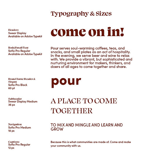
Pour serves soul-warming coffees, teas, and snacks, and small plates as an act of hospitality. In the evening, we serve beer and wine to relax with. We provide a vibrant, but sophisticated and nurturing environment for makers, thinkers, and doers of all ages to come together and share.
Who do we do it for?
The neighborhood! We are here to provide a place to serve our community as a home base of sorts.
Why do we serve our clients or customers the way we do?
We want to provide local residents and workers with a place to relax, relate, and develop their own rituals. We want to be their office space and meeting house.
How do we best serve them?
By offering high quality, wholesome products in an inviting and interesting space with a variety of options for how to “be.”
Why are we in this industry?
We believe in the value of hospitality and the power of place. We believe people are multidimensional and need a place to shift, change, grow, and be multiple versions of themselves. We believe people want to be nourished through their bellies, minds, and hearts, and we aim to offer a place where they can find that nourishment.
Why did we start this business?
We saw a desire in our neighborhood to spend time alone/together and wanted to build a place for that to happen. A warm beverage and a sweet treat is always a good starting place.
What is the brand image we want to convey?
We want to be inspiring, warm, clever, open, and hospitable.
MISSION STATEMENT:
To invite you to sit, gather, and be; helping our neighbors enjoy each other’s company over a cup of what-you-will.
Color & Typescale
Pour, its products, and its customer base are thoughtful, welcoming, and a bit quirky. I selected a deep brown, vibrant red-orange, and an unexpected, but complimentary pistachio green to create an intelligent, but not-too-serious visual base for Pour’s brand identity.
Similarly, I selected Swear as a display typeface that is classy with a wink. Pairing this with a more reserved sans serif, Sofia, rounded out the look and feel of Pour’s type design.


Logo and Icons
Logo
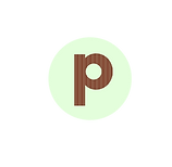
Pour’s logo is born of the simple form of an open cup and the classic round shapes of Sofia’s letterforms. After playing around with a series of overwrought formal ideas, I decided to let the lowercase “p” hold its own as a logo and inform the shapes of all of Pour’s supporting icons.








Icons
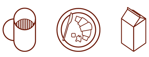
The icon family is built of simple circular and axonometric components. This basic language can be expanded upon as needed.


Product Mockups
Pour’s logo being a simple “p” allowed me to play with color and texture in a way that a more complicated logo might not. From this, I developed a related but more expansive color palette using tints of the brand’s primary colorway. This makes room for seasonal or special occasion alternatives that still feel connected to the primary brand mark.
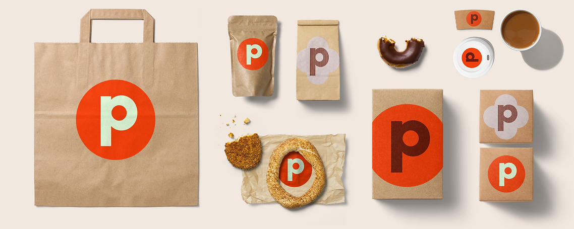
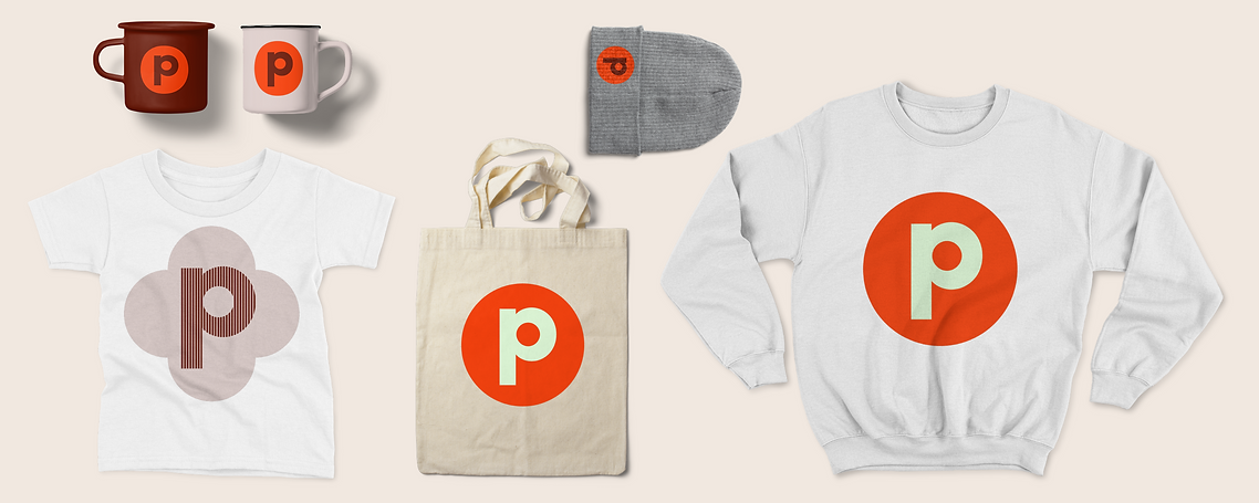
Image Guidelines
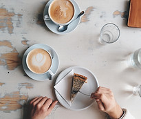
Images used in signage, emails, and other collateral should not compete with the strong graphic vocabulary of Pour’s color, type, and icon, but rather provide another layer of life and texture to Pour’s media options. Pour's graphical system was built around un-ornamented geometries that carry a youthful quality and that could be riffed-on over time. To complement this, I built image guidelines that share the purity of the graphic design while preventing the brand from feeling too sterile.


Social Media
Headers for Facebook and images in Instagram should highlight the slightly nerdy sophistication of Pour, aligning with the whole of Pour’s brand identity. These headers focus on repetition and texture behind the name of the shop and avoid specifics of people and place as Pour's owners wanted that sort of image-making to be connected with visitor's experiences rather than with particular images.


Style Guide
To provide clarity as Pour's branding moves forward and is applied to more products, I developed a comprehensive brand style guide. This document outlines when, how, and where different components should be used and what variations on the brand theme are best. I will add to and augment this document based on client needs and the growth of the business.
Next Steps
As the business gets closer to opening, we will work on building out a website using established brand identity and guidelines. Additionally, I will be developing print collateral such as menus and fliers along with large and small scale signage for the company.
At this time, Pour is relying primarily on Facebook as its social media outlet, but will be putting more energy into Instagram in the coming months. To address this, I will develop Instagram guidelines to help the social-media team create well-considered, consistent posts.
Learnings
Building a brand identity should not only restate what we know about a product, but should build excitement around it.
Familiarity with a brand (especially a neighborhood brand such as Pour) provides comfort and connection that helps lead to long-term brand loyalty. Taking the time to build familiarity early can pay businesses back in spades.
When done well, expansion of a brand identity becomes much simpler as the “rules” of design have been laid out in a cogent way.


